Safestep
Client
Safestep
Project scope
Visual identity, Visual manual, Illustration
Safestep is a company dedicated to finding new solutions to old problems that prioritize safety and accessibility. While it’s a niche industry, they take pride in being the only ones who combine slip protection, fiberglass products, and tactile handrails into one solution. Their approach is all about making smart, sustainable choices for a safer future.

Safestep
Client
Safestep
Project scope
Visual identity, Visual manual, Illustration
Safestep is a company dedicated to finding new solutions to old problems that prioritize safety and accessibility. While it’s a niche industry, they take pride in being the only ones who combine slip protection, fiberglass products, and tactile handrails into one solution. Their approach is all about making smart, sustainable choices for a safer future.

Safestep
Client
Safestep
Project scope
Visual identity, Visual manual, Illustration
Safestep is a company dedicated to finding new solutions to old problems that prioritize safety and accessibility. While it’s a niche industry, they take pride in being the only ones who combine slip protection, fiberglass products, and tactile handrails into one solution. Their approach is all about making smart, sustainable choices for a safer future.

Safestep
Client
Safestep
Project scope
Visual identity, Visual manual, Illustration
Safestep is a company dedicated to finding new solutions to old problems that prioritize safety and accessibility. While it’s a niche industry, they take pride in being the only ones who combine slip protection, fiberglass products, and tactile handrails into one solution. Their approach is all about making smart, sustainable choices for a safer future.

Logotype
Safestep's symbol is an angled staircase that blends with a check mark and warning markings. Together, it captures Safestep's area of operation. The accompanying wordmark, a robust sans serif, amplifies the brand's personality. It's clean, confident and brings trustworthiness and technical precision to the table. Togheter they make up Safestep's logotype and serves as an identifier that is used across various touchpoints.


Colors
Safestep's black and yellow colors really grab attention and are a nod to classic warning signage. To honor Safestep's heritage, we've incorporated these colors into the new concept. Three additional colors were introduced to make it even easier to understand Safestep's products and the environments they live in. Green steel, Corten and Dirty beige are used to categorize different product areas. Plus, we've added two background colors to enhance flexibility in graphic materials for both digital and print.


Typography
A thoughtful type system creates Safestep’s visual voice, balancing clarity and warmth. Clash Grotesk stands out with its bold, uppercase style, adding confidence and authority. For everyday reading, Plus Jakarta Sans provides a smooth, approachable feel, while Roboto Mono adds a clean, technical touch to details like buttons and pricing. Together, these typefaces ensure every message feels inviting, easy to follow, and visually impactful.
Typography
Safestep has three typfaces in their visual toolbox. Clash Grotesk stands out with its bold, uppercase style, adding confidence and authority. For everyday reading, Plus Jakarta Sans provides a smooth, approachable feel, while Roboto Mono adds a clean, technical touch to details like buttons and pricing. Together, these typefaces ensure every message is easy to follow and provides a clear visual hierarchy.


Illustrations
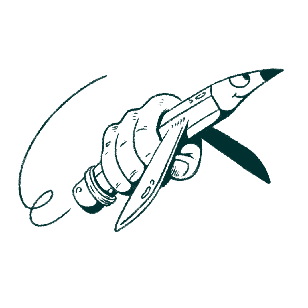
I created a series of custom illustrations to add a cheerful touch to the graphic identity. These visuals not only support the content but also help bring a sense of warmth to different units. The illustrations are used thoughtfully to strike a nice balance between being serious and maintaining a playful vibe.


“If you give Jimmy free rein, the results always exceed expectations! We have used Jimmy many times before, and will do so many times in the future. He helped us find our identity after 10 years of searching. Thanks!”
– Fabian Grana Flygt
Safestep

“If you give Jimmy free rein, the results always exceed expectations! We have used Jimmy many times before, and will do so many times in the future. He helped us find our identity after 10 years of searching. Thanks!”
– Fabian Grana Flygt
Safestep

“If you give Jimmy free rein, the results always exceed expectations! We have used Jimmy many times before, and will do so many times in the future. He helped us find our identity after 10 years of searching. Thanks!”
– Fabian Grana Flygt
Safestep

“If you give Jimmy free rein, the results always exceed expectations! We have used Jimmy many times before, and will do so many times in the future. He helped us find our identity after 10 years of searching. Thanks!”
– Fabian Grana Flygt
Safestep


Menu
Menu

Jimmy Stolpe 2025


Jimmy Stolpe 2025

